Interface Overview
The Tahoma2D interface is organized into rooms, also known as workspaces. Each room is a different collection of panels which are laid out at specific positions on the screen for a specific use.
Room Editing Mode
 “Room Editing Mode” allows for rooms to be added, removed, and renamed. It also allows for panels to be added, removed, or rearranged. To enter or exit “Room Editing Mode”, click on the lock icon on the top right of the workspace.
Tip
How to identify “Room Editing Mode”:
When “Room Editing Mode” is unlocked, all of the panels have a visible header.
Using Rooms

Available rooms are listed on the far right of the menu bar. Each room always displays the contents of the current scene.
Rooms can be named and their order can be rearranged. New rooms can be added and existing rooms can be deleted. When a room is added it is empty; to configure it, panels can be added one by one (see below).
To enter a room, click on the related tab on the far right of the menu bar. If “Room Editing Mode” is active, room tabs can be reordered by clicking & dragging the tabs to a new position.
Tip
To name a room:
Double-click the tab and type the name you want to assign to the room.
Tip
To add a new room:
Right-click in the room tab area and choose New Room from the menu that opens.
Tip
To delete a room:
Right-click the room tab and choose Delete Room “<Name>” from the menu that opens. The current room cannot be deleted.
Tip
To return to the set of rooms provided with Tahoma2D:
Choose Panels → Reset to Default Rooms.
Customizing Rooms
Rooms can be modified by setting different sizes to different panels. When “Room Editing Mode” is active, docked panels can be pulled out to become floating panels and floating panels can be docked.
While “Room Editing Mode” is locked, panels can be resized and new floating panels can be added by using the Panels menu.
Tip
To resize a panel in the room:
Click any vertical or horizontal separator and drag it to the new position.
Note
Some panels like the toolbar have a fixed width or height, therefore they cannot always be resized.
Tip
To open a panel as a floating panel:
Select in the Panels menu the panel you want to open.
Tip
To resize a floating panel:
Click and drag the border or corner of a panel.
Tip
To close a floating panel or a dialog:
Click the close button at the right of the title bar.
Tip
To add a panel to a room:
Use the Panels menu to open the panel as a floating panel.
Click and drag its title bar to move it around and release to dock it according to the highlighted insertion point.
Note
Trying to dock a panel to the leftmost/rightmost part of the interface may fail if the main Tahoma2D window is maximized at that moment. To overcome this, you can restore the main window size, dock the desired panel, and then maximize it back.
Tip
To remove a panel from a room:
Click and drag the title bar of the panel you want to remove to undock it from the room.
Close the floating panel.
Tip
To maximize, or minimize a panel:
Double-click its title bar (for floating panels, the Viewer and the ComboViewer). If there is no title bar, press `.
Note
Some panels like the toolbar and the command bar have a fixed size in one dimension, therefore they cannot be maximized.
Room Panels
Below there is a list of the panels (in the same order in which they appear in the Panels menu) that can be used to build rooms and that can be opened as floating panels.
Batch Servers
The Batch Servers panel allows you to process the batch list by using the render farm, and contains information about the list of server (rendering) nodes defined for the farm.
Cleanup Settings
The Cleanup Settings panel allows you to define the parameters for the clean-up process of scanned raster images, in order to convert them into Smart Raster images, ready to be painted in Tahoma2D.
Color Model
The color model viewer displays the image, or animation level, you loaded as reference to paint the current animation level.
See Using a Color Model .
File Browser
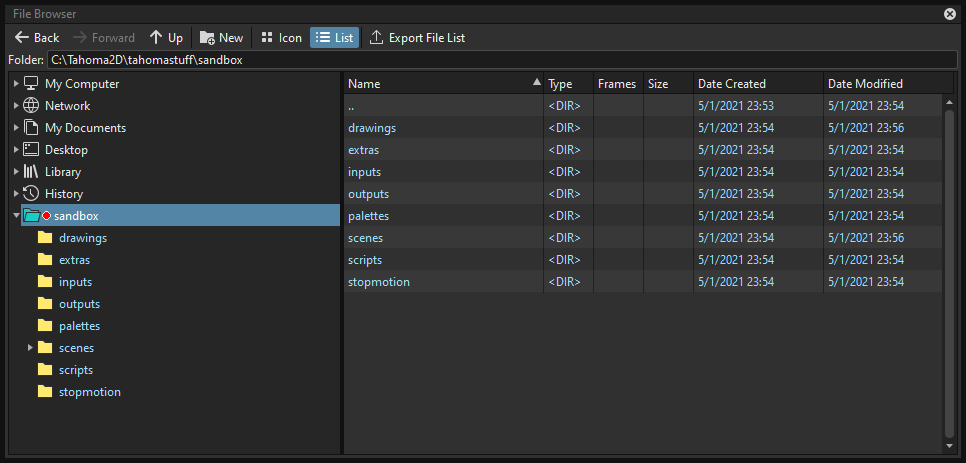
The file browser allows you to load and save files, and to access projects.
On the left there is a file tree with some main folders containing material stored on your computer: My Computer, Network, My Documents, History, Library and Projects. You can open folders and sub-folders in order to retrieve files that are displayed in the area on the right.
See Managing Projects and Using the File Browser .
Flipbook
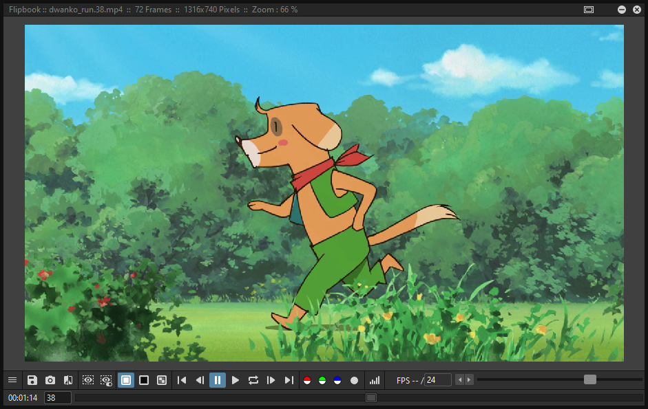
The flipbook can display animation levels, clips or sequences of images. It can be used to check levels for instance before loading them, or to control a rendered sequence.
See Using the Flipbook .
Function Editor
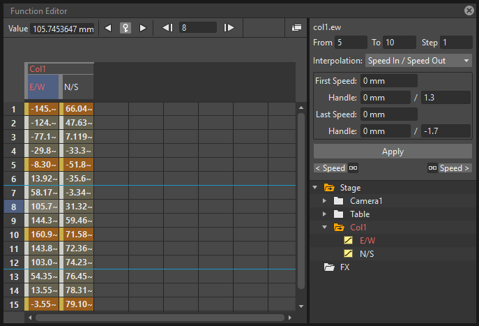
The function editor maps objects and FX transformations with key values and related interpolations by using a spreadsheet or a graph editor. It is divided into two sections: on the left there is an area where the spreadsheet or graph editor is displayed, on the right top is an area where the interpolation of the current transformation segment is displayed, and on the right bottom is the objects/FX tree.
Level Strip
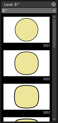
The level strip displays the sequence of drawings belonging to the level currently selected in the Xsheet.
It helps you to edit the sequence of drawings and to see all the drawings of the current level, even if those drawings are not exposed in a Xsheet.
See Editing Animation Levels .
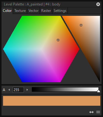
Palette
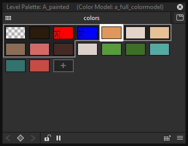
It displays the styles defined for the current level, or in case it is inactive the styles defined for a previously selected level.
See The Palette Panel .
Scene Cast
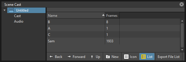
The scene cast panel lets you control the files loaded in the scene, save them and load new ones. It can be organized in folders and sub-folders.
See Using the Scene Cast .
Schematic
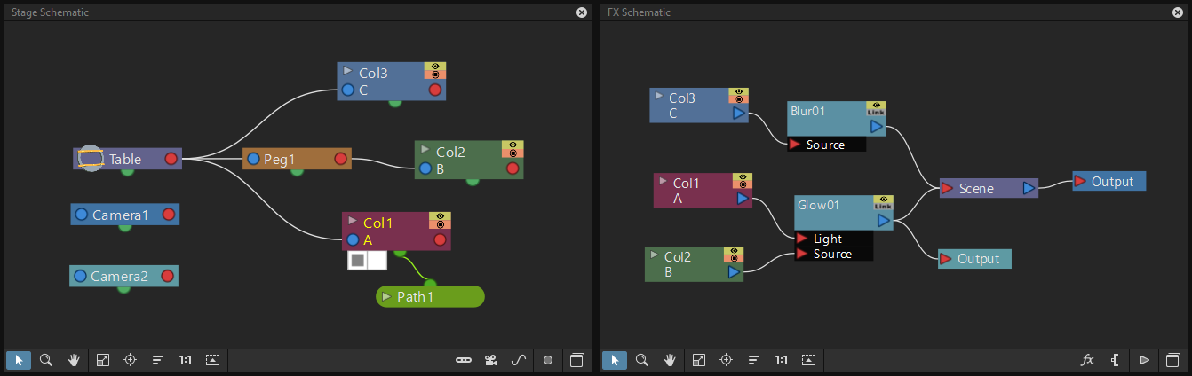
The schematic can alternatively display stage information or special FX usage.
The stage schematic displays as nodes all the objects defined in a scene, i.e. columns, pegbars, cameras, the table and motion paths, and allows you to manage the way they are linked to each other.
The FX schematic allows you to apply FX to the content of Xsheet columns, and to manage the way they are applied. All the columns and FX are displayed as nodes that can be connected in order to set the way FX affect the scene content.
Studio Palette
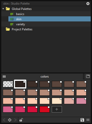
The studio palette allows you to store an unlimited number of level palettes. From here any palette can be retrieved and assigned to the current level in order to paint it, with no need to define the same styles again and again. It also includes a viewer displaying the styles of the currently selected palette.
See Using the Studio Palette .
Style Editor
The style editor allows you to modify the palette styles. You can choose the type of style among color, texture, vector and raster. There also is a settings tab where you can decide some parameters for the style.
See Editing Styles .
Tasks
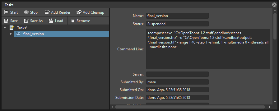
The Tasks panel contains the task tree with all the tasks submitted to the batch processing, and information about the task currently selected in the tree. From the task tree you can start or stop a task execution, or remove it.
Message Center
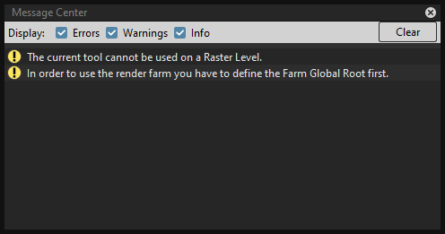
The message center displays in a list the messages Tahoma2D is sending to the user. You can set filters on the messages showed in the panel using the appropriate radio buttons, or you can clear completely the list pressing the Clear button.
Toolbar

The toolbar contains tools to draw, select and edit drawings, and to animate objects like the camera, columns and pegbars. The tools in the toolbar can only be used in the main viewer.
Note
If the toolbar is too short to display all the tools, it can be scrolled by using arrow buttons available at its ends.
 Animate modifies the position, rotation and size of the current objects (see Animating Objects ).
 Selection performs a selection and transforms it (see Using the Selection Tool ).
 Brush draws in the work area in freehand mode (see Drawing with the Brush Tool ).
 Geometry draws geometric shapes (see Drawing with the Geometric Tool ).
 Type adds text by setting the font and size (see Adding Text ).
 Fill fills drawing areas with the current style (see Filling Areas ).
 Smart Raster Paint paints lines and areas in Smart Raster drawings in freehand mode. (see Filling Areas ).
 Eraser deletes vectors in vector drawings, and painted areas and lines in raster drawings (see Drawing Tools ).
 Tape joins two open ends of one or two vectors in vector drawings, or closes gaps in raster drawings (see Joining and Splitting ).
 Style Picker picks a style from the current drawing, that becomes the current style in the palette and in the style editor.
 RGB Picker picks red, green and blue values from the viewer content, and applies them to the current style (see Plain Colors ).
 Control Point Editor modifies the vector shape by editing its control points (see Editing Vector Control Points ).
 Pinch modifies the vector shape by clicking and dragging anywhere on the vector (see Changing the Bend of Vectors ).
 Pump locally modifies the vector thickness by clicking on the section you want to affect and then dragging up or down (see Using Other Modifier Tools ).
 Magnet deforms several vectors at once by clicking the area you want to affect and dragging (see Using Other Modifier Tools ).
 Bender bends vectors in vector drawings (see Using Other Modifier Tools ).
 Iron removes creases from vectors by moving the cursor on the vector you want to flatten (see Using Other Modifier Tools ).
 Cutter splits a vector in two sections when clicking on it (see Joining and Splitting ).
 Skeleton defines character models, and animates them as in cutout animation (see Using the Skeleton Tool )
 Tracker tracks specific regions in a sequence of images (see Tracking Points ).
 Hook defines reference points to be used in the stage schematic to move an object, or link one object to another (see Using Hooks ).
 Plastic builds a mesh that allows to deform and animate a character or part of it (see Using Plastic tool ).
 Zoom zooms in and out the viewer content; after you click you can drag up to zoom in the work area, or drag down to zoom out.
 Rotate rotates the viewer content; if the 3D view is activated, the Rotate tool lets you change the point of view.
 Hand pans over the viewer content; if the 3D view is activated, the Hand tool lets you pan over the 3D view as well.
Tool Options Bar

The tool options bar displays settings for the current tool, if it has any.
For example it lets you set the thickness and other properties of the Brush tool.
Note
If the tool options bar is too short to display all the tool options, it can be scrolled by using arrow buttons available at its ends.
Command Bar
The Command Bar is a place where the user can display favorite Tahoma2D tools and commands to have them readily available.
The Command Bar panel can be docked in any part of the Tahoma2D UI.
Note
If the Command Bar is too short to display all the command buttons, a double-arrow symbol will appear at the right end of it, allowing to display a drop down menu with the rest of them.
Tip
To display the Command Bar:
Choose Panels → Command Bar.
Tip
To customize the Command Bar buttons:
Choose Panels → Command Bar to open the Command Bar.
Right click on it and select Customize Command Bar from the menu that opens. The Customize Command Bar panel will open.
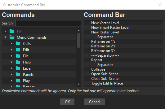
To add a command: Search for a command in the Commands list (left) and drag it to the Command Bar list (right).
To add a separator: At the end of the Commands list (left), drag the —-Separator—- item to the Command Bar list (right).
To delete a command: Locate the command in the Command Bar list (right), right click on it and select Remove from the menu that opens.
Click OK to accept the changes or Cancel to discard them.
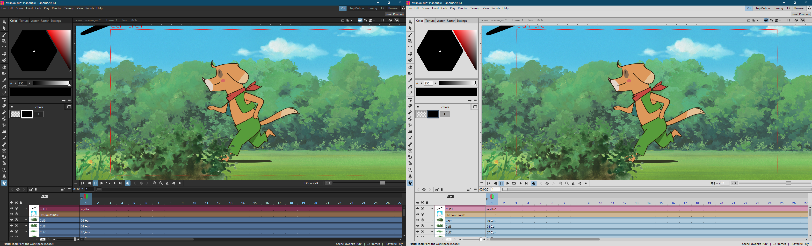
Viewer
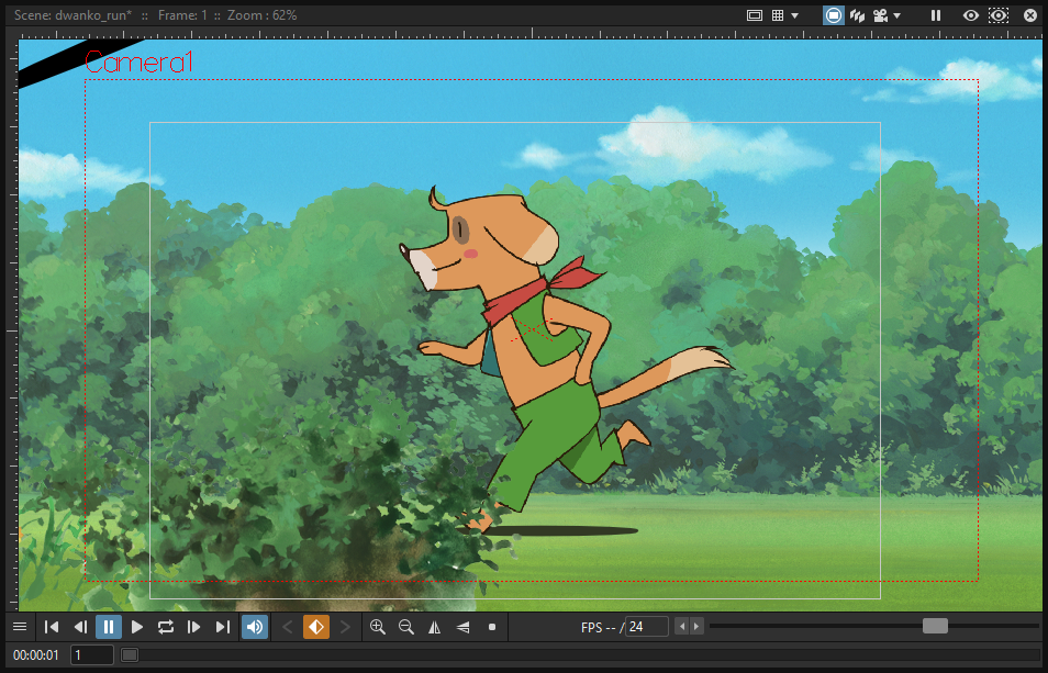
The viewer is the work area where you can draw images and see at the same time the result of your compositing. It is endless and you can scroll, zoom in, zoom out and rotate it the way you prefer.
It has different modes of visualization among which you can choose the more suitable to the operation you are performing.
See Using the Viewer and Previewing the Animation .
ComboViewer
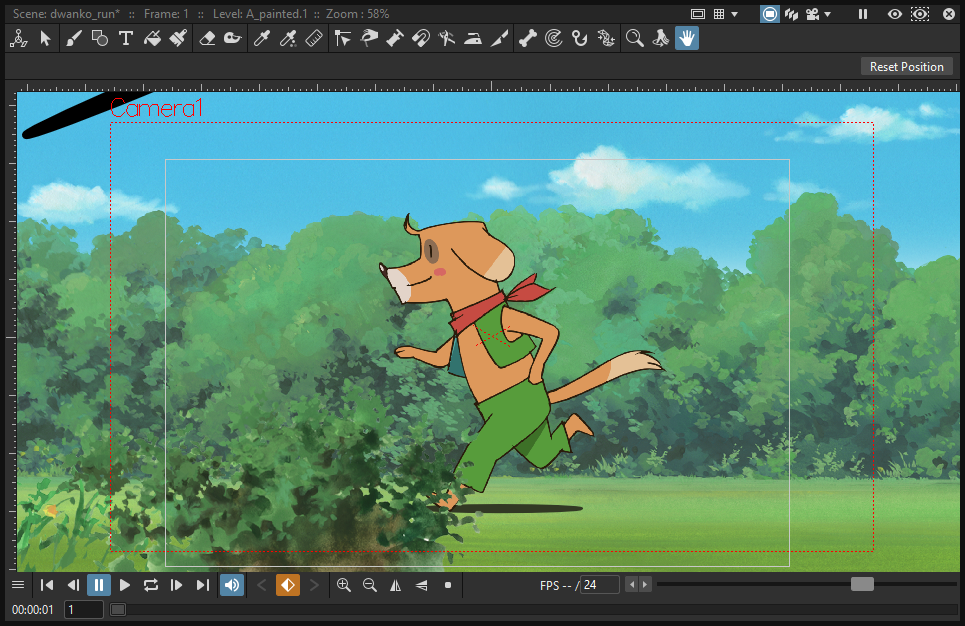
The comboviewer integrates in a single panel a viewer, horizontal toolbar and a tool options bar. It’s and alternative work area where you can draw images and see at the same time the result of your compositing. It is endless and you can scroll, zoom in, zoom out and rotate it the way you prefer.
It has different modes of visualization among which you can choose the more suitable to the operation you are performing.
See Using the Viewer and Previewing the Animation .
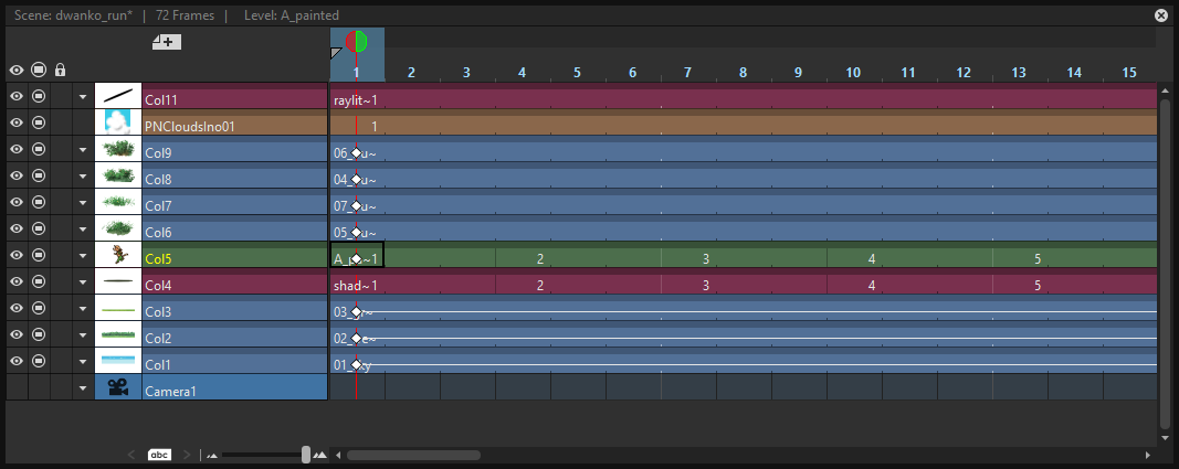
Xsheet
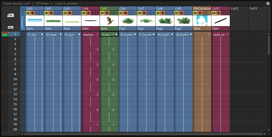
The Xsheet allows you to manage the scene content, in the same manner as the timeline. It is organized in columns, and columns are divided into cells, representing the content of that column in that particular frame. In the columns you can load animation levels, clips, images, audio files or other Xsheets.
Each column has its own header containing information about its content. The column on the far left displays the frame number, with a cursor placed on the current frame. The headers area and the frame column are always visible, even when scrolling the Xsheet area; in this way it’s easier to understand how the scene is built.
Frames are rendered reading images from left to right in each cell row.
See Working in Xsheet .
Timeline
The timeline allows you to manage the scene content, in the same manner as the Xsheet. It is organized in horizontal layers, and layers are divided into cells, representing the content of that layer in that particular frame. In the layers you can load animation levels, clips, images, audio files or other timelines.
At the leftmost part each layer has its own header containing information about its content. At the top part of the timeline there is a time ruler that displays the frame number, with a cursor placed on the current frame. The headers area and the time ruler are always visible, even when scrolling the timeline area; in this way it’s easier to understand how the scene is built.
Frames are rendered reading images from bottom to top in each cell column.
See Working in Xsheet .
History
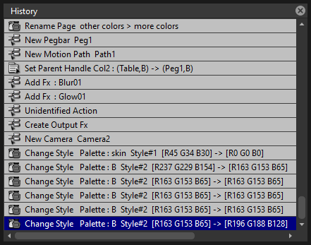
The history panel, lets you check and undo/redo the history of the latest actions performed in the current Tahoma2D scene.
Record Audio
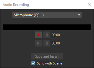
The record audio panel, lets you record a live audio source, listen to it, and insert it into a new audio column of the Xsheet. The insertion point will be located at the right of the selected cell column, and starting at the selected cell frame.
Note
Currently, this panel cannot be docked to form part of a room, like the other ones in the Panels menu. Instead it must be opened as a floating panel, when needed.
Customizing the Interface Appearance
The appearance of the Tahoma2D interface can be customized to suit any production need by choosing a specific language and interface theme.
Tahoma2D allows users to choose a specific language for the software interface, including menus, commands, tooltips, and on-screen messages. Currently available languages are: English, German, Spanish, French, Italian, Czech, Russian, Chinese, Japanese and Korean.
There are also several included themes to choose from: Dark, Darker, Light, Medium and Neutral.
The Tahoma2D interface theme set to Dark and to Light.
The interface themes are defined by means of a QSS file, whose concepts, terminology, and syntax are inspired by CSS files (HTML Cascading Style Sheets). The QSS files also refers to a set of PNG images that are used to create interface widgets.
These files are stored in a folder named as the QSS file, and located in the C:\Tahoma stuff\config\qss folder on Windows and Tahoma stuff\config\qss folder on Macintosh.
Note
The QSS file for Macintosh is named with the _mac suffix.
The QSS file can be edited with any text editor software, e.g. Notepad or TextEdit; the PNG images with any image editor software. Editing the QSS file requires some skill in CSS language, but some changes like colors of panel elements, can be easily done by expressing them with red, green and blue values.
Note
The QSS files defining the colors and the images used in the Tahoma2D interface have to be written according to a specific syntax, otherwise Tahoma2D interface will not be displayed properly. If you decide to edit a QSS file, make a backup copy first in case you need to revert the file to the original version.
Tip
To choose the interface language:
Choose File → Preferences → Interface.
In the Language* option menu choose the language you want to use in the interface.
Restart Tahoma2D to have the interface in the selected language.
Tip
To choose the interface theme:
Choose File → Preferences → Interface.
In the Theme option menu choose the style to be applied to the interface.
Tip
To create a new theme:
Navigate to
C:\Tahoma stuff\config\qssfolder on Windows andTahoma stuff\config\qssfolder on Macintosh.Duplicate one of the already existing style folder.
Rename the folder and the QSS files inside it with the name you want to assign to the style.
Edit the QSS file and the PNG images contained in the new folder.
Note
The new style will be available in the Preferences dialog the next time you run Tahoma2D.
Tip
To edit style QSS file:
Open and edit with a text editor software (e.g. Notepad or TextEdit) the QSS files available in the style folder.
Tip
To edit style images:
Open and edit with an image editor software the PNG files available in the style folder.
Advanced Preferences and Options
By default, several more advanced preferences and options are hidden in the user interface as a way of simplifying the user experience. To show them back, there’s an option in the Preferences window.
Tip
To show the Advanced Preferences and Options in the interface:
Choose File → Preferences → General.
Enable the Show Advanced Preferences and Options setting.
Restart Tahoma2D to see the advanced preferences and options in the interface.
Advanced Preferences enabled
- Interface
Unit (Default: Pixel)
Camera Unit (Default: Pixel)
Pixels Only (Default: On)
Rooms (Default: Default)
Viewer Zoom Center (Default: Mouse Cursor)
Font* (Default: Segoe UI)
Style* (Default: Regular)
Show Icons In Menu* (Default: Off)
- Loading
Use Camera DPI for All Imported Images (Default: On)
- Drawing
DPI (Default: 120)
Down Arrow at End of Level Strip Creates a New Frame (Default: On)
- Tools
Use the TLV Savebox to Limit Filling Operations (Default: Off)
Use Ctrl+Alt to Resize Brush (Default: Off)
- Scene
Sync Level Strip Drawing Number Changes with the Scene (Default: On)
Show Current Time Indicator (Timeline mode only) (Default: On)
Show “ABC” Appendix to the Frame Number in Scene Cell (Default: Off)
Note
When Show Advanced Preferences and Options is Off the values for Unit, Camera Unit and Pixels Only revert back to default values. All other advanced preferences values will be retained if changed from the default.
Advanced UI Options enabled
- Style Editor
Auto and Apply buttons
- Timeline/Xsheet
Toggle Xsheet/Timeline orientation button
Frame dropdown (Frame, 3sec Sheet, 6sec Sheet, etc.)
- Canvas Size popup
Unit: dropdown
- Startup, Level Settings, New Level, Level Info, Current Camera Settings, Load Level, Output Settings, Cleanup Settings popups:
DPI and Resolution related fields which become available usually when Pixels Only is not on)